off-canvas, 모바일 터치 영역, 모바일 화면 터치, 모바일 네비게이션, 모바일 UX, 모바일 손가락, 모바일 엄지 손가락, 핸드폰 엄지
내장 애플리케이션 패턴에서 영감을 얻은 다른 방법은 off-canvas 네비게이션이다. 네비게이션은 메뉴 링크나 아이콘 밑에 숨어있다. 사용자가 링크를 클릭하면 네비게이션은 패널 형태로 왼쪽부터 오른쪽으로 미끄려져 나오고 주된 콘텐츠를 밀어낸다.
이 기술에 있는 문제점은 네비게이션이 화면 위에 계속 남아있다는 점이다. 루크 로블르스키는 그의 글인 “반응형 네비게이션: 모든 기기에서 터치 최적화 하기”에서 종류별로 접근하기 쉬운 영역을 보여준다. 모바일에서 가장 도달하기 어려운 영역이 왼쪽 상단이다.
이것에 기초해 제이슨 위버Jason Weaver는 화면 하단에 몇 가지 네비게이션 사례를 만들었다. 한 가지 해결책은 ‘하단 고정 메뉴footer anchor’와 ‘메뉴’ 링크다. 하단 고정 메뉴로 작은 기기에서 네비게이션을 화면 하단에 놓고 메뉴 링크로 사용자를 거기로 보낸다. 이는 HTML 앵커 링크 시스템anchor link system을 사용한다.
즉, 사용자가 도달하기 쉬운 영역은 사용자가 그만큼 빠르게 다가가기 위하여 손을 근처에 두게되며 이러한 동작에 따라 사람은 시야의 장애물이 되는 손이 있는 위치로 시선이 가는 것에 불안함을 느껴 모바일 기기를 사용할때 시선을 상단에 위치하게 된다.
이렇기 때문에 웹과는 다르게 네비게이션 영역을 최소화하고 사용자의 시선을 방해하지 않고 손이 빠르게 접근할 수 있는 하단에 배치해야 한다.
여기에 착안하여 아래와 같은 내용을 유추할 수 있었습니다.
예를 들어 다음 앱의 경우 네비게이션 버튼이 하단 스크롤시 사라져 사용자가 다시 최상단으로 올라와야하는 불편함이 있으며 상단에 위치하여 사용자 눈에 들어오는 정보가 '장애물(손)'과 '상단 네비게이션(배너)'로 인해 적어집니다.
네이버 앱은 하단에 배치함으로 사용자의 시야와 동작의 불편함을 최소화 했으며 이러한 배치의 문제점 (최하단 이동시 정보를 가림)은 회사 관련 라벨박스를 만들어 최소화 시켰습니다.
본문 내용 더보기▼
Why do these navigation menus work across a wide range of touch screen sizes? Why do we care about touch across a wide range of screen sizes? Read on...
Across Screen Sizes
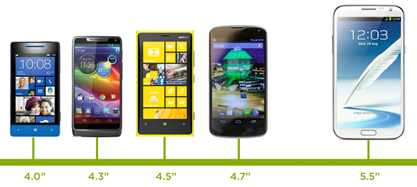
First, why do we care about touch across a wide range of screen sizes? Isn't touch just used on mobile devices and tablets? While it's true touch interfaces are increasingly present on small screen sizes, there's a lot of diversity even in this class of devices. Consider in the past two months smartphones ranging from 3.5" to 5.5" have been released by major manufacturers.
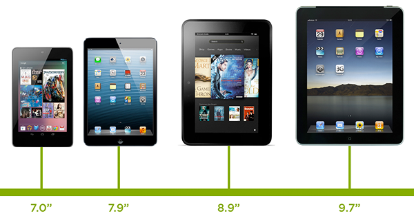
Tablets are no different. Again in the past two months alone we've seen tablets released with 7" screens, 10.1" screens, and everything in between.
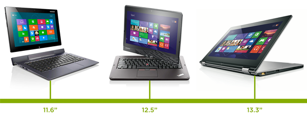
And the very notion of what defines a tablet is being challenged by laptop/tablet convertibles and touch-enabled Ultrabooks. These devices range from 11.6" to 13.3" inch screens and treat touch as a primary input method. In fact, early testing by Intel found that touch was even a preferred input method on touch enabled laptops.
Even beyond 13 inches, touch and gesture interfaces are possible. Consider Sony's 20" VAIO Tap or the use of a gesture interface like Leap Motion on any sized-screen and really quickly you realize touch is an input model to consider across all screen sizes.
Accounting For Touch
So what does it mean to consider touch across all screen sizes? Two things: touch target sizes and placement of controls. Any navigation system that needs to work with touch needs to have menu options that can be comfortably used with imprecise fingers. It also needs to be positioned in a way that aligns with how people hold and use touch-enabled devices.
Touch target sizes are relatively easy: just make things big enough to prevent accidental taps and errors. Your reaction to this may be "but I have so many things to fit in my app. How can I do that if the touch targets have to be so big?" frankly you can't and quite often that's a good thing.
Designing towards touch really forces us to simplify and decide what's most important- what needs to stay on the screen. If we go through that exercise we ultimately end up with software that's easier to understand and as a result more often used. Both good things. And while big touch targets can be comfortably used with a mouse (in fact they'll be easier to hit with a mouse), small mouse size targets can't be used easily with touch. So when in doubt, optimizing for touch will make sure things are usable for both mouse and touch users.
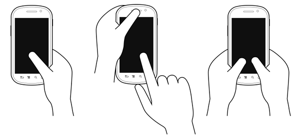
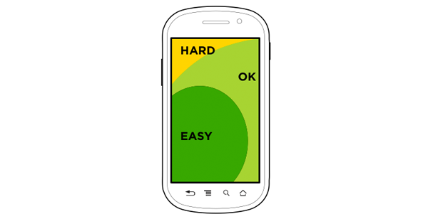
But accounting for touch isn't just about the size of controls, the placement of controls is important as well. To understand why this matters, let's look at how people hold a smartphone. In each of these examples, the bias is toward right handed use as most people in the world are right handed.
These common patterns of posture create easy to hit and hard to reach touch areas. The area toward the bottom of the screen is easy, whereas the upper corners are a bit of stretch. So the bottom area of a smartphone screen is where we want to put an application's most common and important interactions. Where they can be reached quickly and easily.
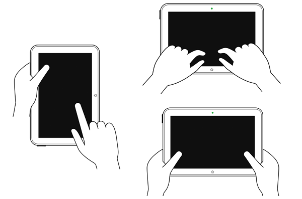
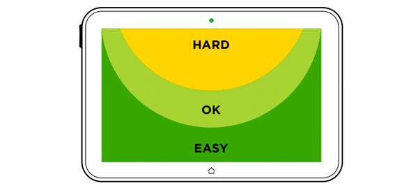
Similarly we can look at tablet postures or how people typically hold tablet computers. That is two hands along the sides, or typing over the screen in their lap. In the landscape postures we see a different series of easy, ok, and hard to hit touch areas.
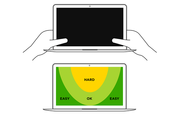
With touch-enabled laptops, people get pretty close to the screen and use their two thumbs to tap which yields easy to hit areas in the bottom corner of the screen.
As you've hopefully observed the common pattern here is comfortable touch surfaces toward the bottom of the screen. Looking at the ergonomics of use across devices types pushes us toward the bottom, which is where we'd ideally like to place important functionality like navigation controls.
An Adaptive Solution
Today, most Web navigation systems are designed for a mouse and keyboard world. They're placed prominently across the top of the screen or along the sides. In other words, everywhere but in easy to touch areas.
In our earlier multi-device designs, we accounted for this convention by creating a series of navigation structures that adapted from comfortable touch zones on small screen devices to the kinds of navigation structures people have come to expect on desktop and laptop computers (top of screen, etc.). You can see a number of these explorations in Off Canvas Multi-Device Layouts.
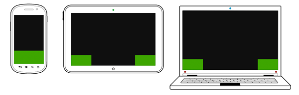
But given how things are changing and touch is permeating nearly every sized screen, it may be time to revisit that structure. Specifically, rather than optimizing for touch only on small screens, optimizing for it on all screens. That means big touch targets and bottom positioning throughout.
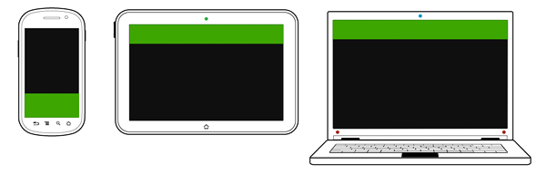
Of course we still have to account for varying screen widths, so our navigation controls will have to change as more space becomes available. To account for this, we decided to shift from a single row navigation structure on small screens to a split row model on larger screen sizes.
You can see this technique in action in the sample pages below:
Whether or not this multi-device navigation structure is the best answer for an increasingly touch-enabled computing world remains to be seen. However, rethinking our existing conventions is exactly the kind of thing we should be doing during the kind of fundamental changes we are seeing today. New input methods and devices are challenging our long-standing assumptions and that's a good thing for Web design.
Thanks to Jason Weaver for bringing these ideas to life! Check out some of our other multi-device collaborations in: